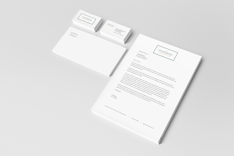
peter kiewit foundation rebrand
After thoughtful planning throughout his lifetime, the bulk of Peter Kiewit’s personal estate was set aside upon his death in 1979 to create a foundation to support charitable and public purpose projects in Nebraska and other limited geographic areas.
Peter Kiewit Foundation has honored Mr. Kiewit’s legacy by awarding more than $640 million in grants and scholarships since its founding.
challenge
The team at Peter Kiewit Foundation engaged David Day Associates to honor Mr. Kiewit’s legacy in a different way: through striking design. Peter Kiewit Foundation is defined by its balance within a continuum: it is mindful of the past while looking to the future; it stands as a strong leader in the community while strategically collaborating and innovating; it cares deeply about breathing life into urban and rural areas, young and old, historic and modern.
solution
brand identity
before
after
With this in mind, the brand identity we designed pairs classic simplicity with fresh, approachable stylistic details. It is timeless and sleek – understated enough to stay behind-the-scenes, yet elegant enough to take the stage when necessary. Supported by a warm, inviting color palette and dynamic pattern, this brand identity will carry the Peter Kiewit Foundation legacy forward with grace and energy.
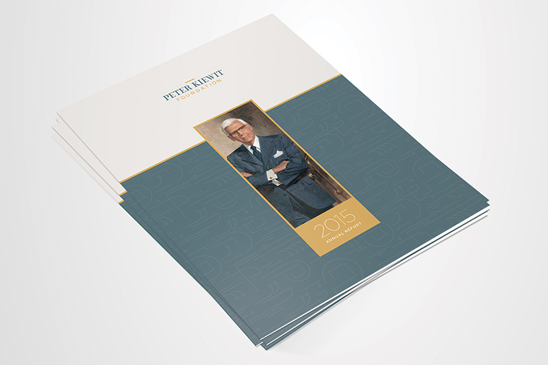
The color palette celebrates the beauty of the landscape across Nebraska and Western Iowa. The rich amber yellow and cool teal blue, supported by a soft slate gray and dusty cream, together create a feeling of warmth and depth. The foundation sector is saturated with deep blue hues and crisp white. This contemporary, friendly and distinguished palette breaks the mold.
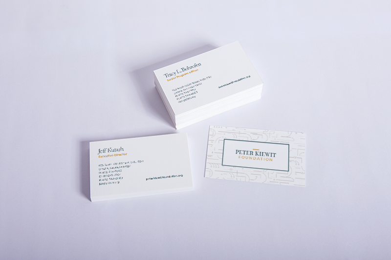
We also designed a custom pattern to be applied across communication materials tastefully and sparingly to accent the design and illustrate the dynamic nature of PKF’s work. Inspired by the foundation’s roots in the construction industry, intricacies of mechanical schematics, instructional subway maps and the natural environment, the pattern illustrates movement and growth. Linear elements and squares within circles suggest putting structure around ideas and spaces, building communities up and connecting the dots.
One might see conversations and people on-the-go. Another might see a woodgrain pattern, an architectural drawing or a sprawling landscape. Others may simply sense coordination, harmony and synergy. Regardless, it feels alive, interactive and forward-thinking like the foundation itself.
The wordmark we crafted is subtle, modern and surprisingly powerful. The primary font was created exclusively for Peter Kiewit Foundation. It is strong and masculine, without being overbearing, and incorporates soft curves that give it an engaging feel. It was designed to convey consistency, experience and contemporary relevance by straying just enough from the traditional and oft-overused serif fonts. The word “foundation” acts as a literal foundation in the signature – drawing one’s eye to the simple bar at the top and, thus, illustrating the supportive role PKF plays in helping organizations and communities rise above the bar.

