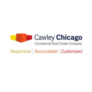
cawley chicago rebrand
For its 18th anniversary, Cawley Chicago, one of the region’s leading boutique real estate brokerages, engaged David Day Associates to renovate its brand identity. After working with Silva Brand, our strategic partner in Chicago, to gain an understanding of its core brand and competitor landscape, Cawley’s stakeholders collaborated with our team articulate Cawley’s visual identity.
Approachable and honest submarket specialists, the professionals at Cawley Chicago value every one of their clients. They do not disappear after a deal is made, but remain accessible to clients throughout the negotiation and legal phases of each real estate transaction.
solution
brand identity
before
after
Our task at David Day Associates was to infuse this individualizing energy into Cawley’s brand. Considering their niche market position, we created a trademark that is both reflective and transparent, a multi-dimensional visual reference. While it is literally two Cs facing one another, it also depicts the segment of the market Cawley very carefully stays within. The collateral system extends the geometric design of the trademark and leverages the powerful new color scheme that shifts boldly away from Cawley’s previous visual identity.


