opera omaha rebrand
Opera Omaha, the only professional opera company in Nebraska, produces a season of original main-stage productions presented at the historic Orpheum Theater, and smaller productions and musical events throughout the community. Opera Omaha is highly regarded regionally for its extensive education and outreach program that annually reaches thousands from elementary school through adulthood.
challenge
Seeking to learn more about its existing and potential audiences, Opera Omaha partnered with David Day Associates in an effort to better communicate with and nurture current audiences while simultaneously attracting new audiences. Additionally, Opera Omaha endeavored to understand how the company brand is perceived both generally and as compared to other Omaha arts organizations.
solution
brand identity
before
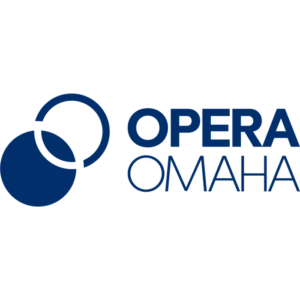
after
We conducted strategic discovery activities to better understand current patrons’ entertainment preferences and behaviors, to define and reach untapped audiences and to learn how current patrons and the general public view the Opera Omaha brand.
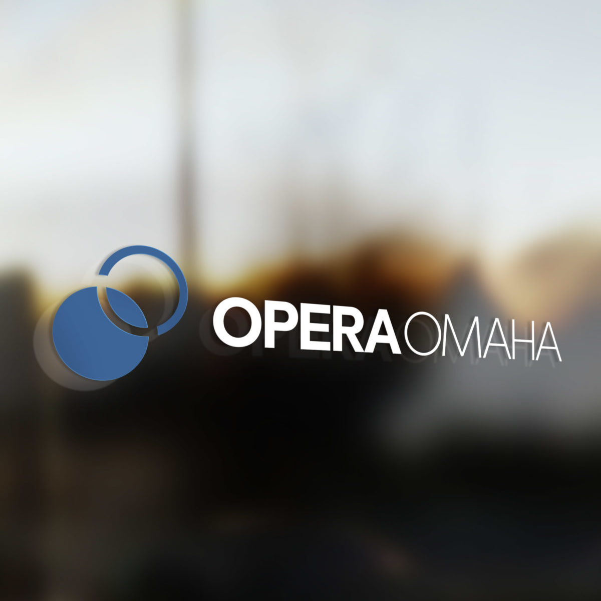
With an eye to the future, we collaborated with the Opera Omaha project team to design a striking new brand identity which features two interlocking Os. The two Os echo one another and represent the unification of the opera community and the Omaha arts community. The Os are distinct yet united; one cannot exist without the other. The blue color was selected to pay homage to the legacy logo. It is a timeless shade that looks back to the past and forward to the future simultaneously, just as Opera Omaha does when it elevates classic operas for modern audiences. The font we selected is sleek, modern and precise. It stands out in a crowd just as Opera Omaha aims to do.
impact
It is our belief that truly powerful brand identities should represent the heart and soul of a brand and communicate to audiences what the brand stands for at its core. We did not feel that Opera Omaha’s legacy logo was accomplishing that goal, as the brushstroke “O” spoke more to the visual arts than the performing arts. Their refreshed brand identity more directly conveys who they are to both existing and potential audiences.


