dental works rebrand
Dental Works, a longstanding general dentistry practice in Columbus, Nebraska, identified the need to bring their practice forward into the digital space with a strong visual identity. David Day Associates was chosen to assist them in this endeavor.
solution
brand identity
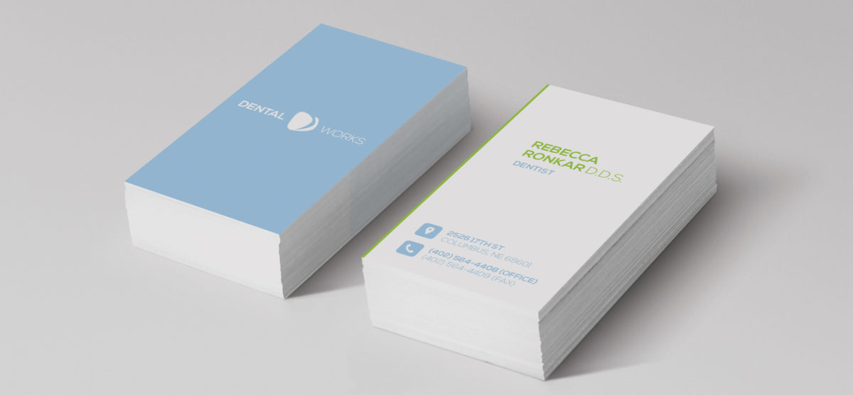
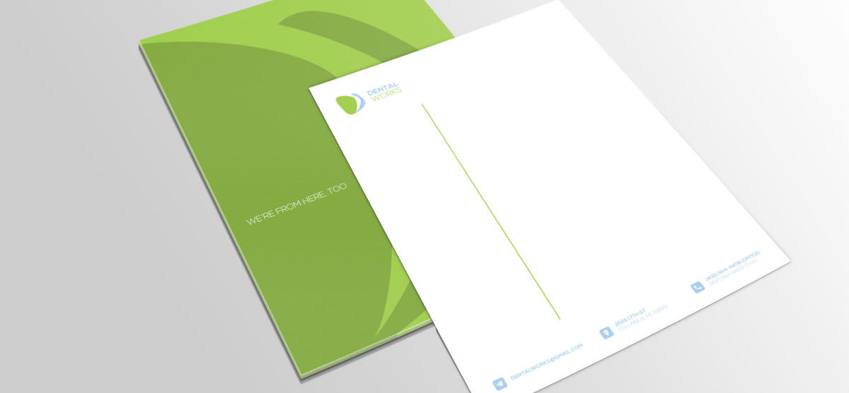
To kick-off a multi-phase rejuvenation project, we created a brand identity that captures the friendliness of the practice. The trademark calls to mind an unfolded fan or a deck of cards, with the three folds or cards representing each of the three high schools in Columbus. It symbolically unites the three schools and connects the brand with the themes of community and neighborhood. The trademark is futuristic in its design, but not so abstract that the subtle D and W within the design go unseen. The fresh, clean color palette, featuring a cool sky blue and vivid green, visually enhances the minimalistic, clean lines of the trademark and evokes a sense of tranquility. The logotype further enriches the fresh feel of the brand with its modern, sans serif font.
impact
The new brand identity has been well-received by office staff, patients and the Columbus community overall.


