nebraska spine + pain center brand unification
Nebraska Spine Center (“NSC”) in Omaha and Spine & Pain Centers of Nebraska (“SPC”) in Lincoln joined forces to set the standard for life-changing spine care and pain relief under the new name Nebraska Spine + Pain Center (“NSPC”).
challenge
Shortly following the official merger, NSC and SPC engaged David Day Associates to help focus and inform the unification process. By identifying and clarifying why they exist, refining their brand identity and crafting a shared name, we transitioned two practices with a common goal into one.
solution
brand identity
before
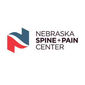
after
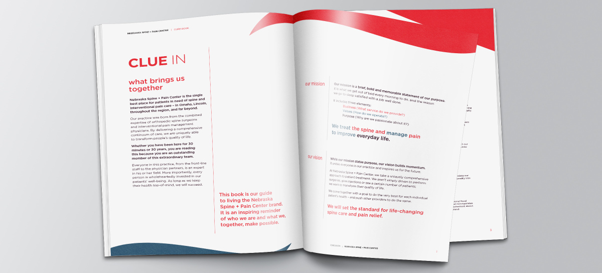
To breathe life into NSPC’s emerging brand, we set out to explore what the two existing groups did, how they did it, and most importantly, why their work was significant. Through our discovery process, we examined each entity from internal, patient, and market points of view to construct a crisp identity. Informed by our research findings, NSPC was able to increase collaboration while maintaining balance between the two merging units.
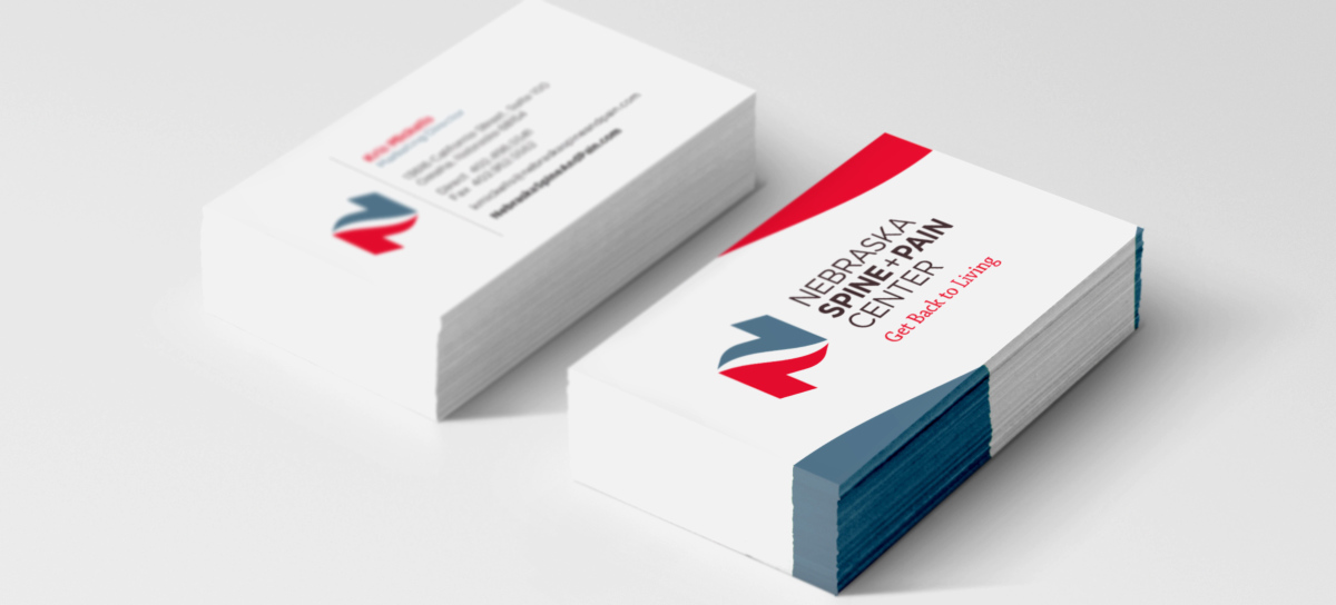
Despite the natural fragmentation that comes from starting with two completely distinct brands, we worked to distill NSPC’s core mission and create a visual expression of the brand. The logo and associated design elements represent NSPC’S emphasis on partnership and the energy they put into transforming patients’ quality of life. Two elements come together to form a dynamic letterform “N,” while also creating a subtle S-shaped “spine” in the negative space. The image is uplifting and fosters an immediate association with NSPC’s geographic roots.
impact
Under our magnifying glass, the expertise of orthopedic spine surgeons and interventional pain management physicians were combined to form a new patient-driven practice. Sharing knowledge and maximizing each other’s strengths, NSC and SPC continue to set new standards as NSPC.
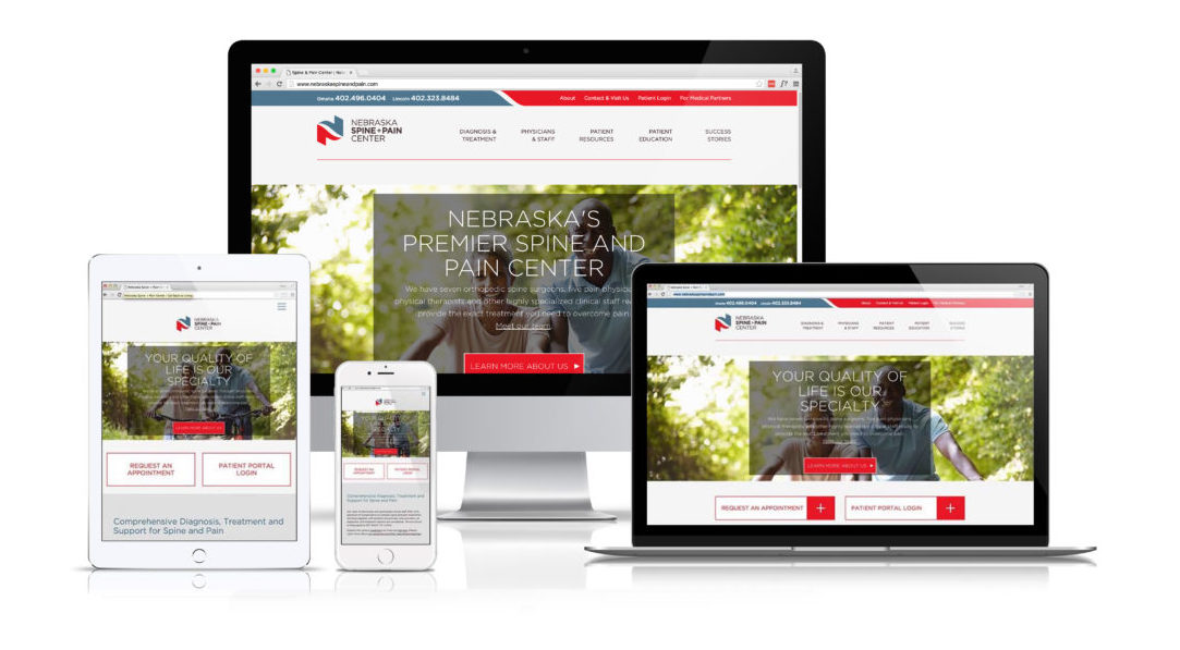
After helping manage the merger and rebrand, we again partnered with NSPC to design and launch a responsive, brand-driven new website.
NSPC’s letterform “N” logo and overarching brand identity, featuring a strong red and grey-blue color palette, are seamlessly woven into the look and feel of the freshly built website. With a patient portal and the ability to make appointments online, the educational website truly lives up to NSPC’s vision to “set the standard for life-changing spine care and pain relief.”

