bank of bennington rebrand
Bank of Bennington is a spirited community partner. Its goal is to meet the unique needs of its customers and to create customized solutions in a welcoming environment. From a child’s first savings account to complex business loans, Bank of Bennington offers innovative expertise with a personal touch. While the bank has evolved and grown over the years, professionalism, personal service and courtesy endure as hallmarks of the institution.
challenge
David Day Associates partnered with Bank of Bennington following its acquisition of Bank of Ashland to create a fresh brand identity and striking stationery package for the exceptionally friendly and growing bank. The merger with the Ashland location created an opportunity to refine their visual aesthetic and ensure that their brand identity clearly communicates who they are and what they stand for.
solution
brand identity
before
after
The brand identity we developed brings this spirit to life. The trademark represents interlocking hands and interconnected services, and speaks to the bank’s role as a community partner. The trademark is open and active, representing the bank’s transparency and flexibility, and the upward direction of the design elements signal growth and success. When reduced, the trademark subtly references a fingerprint, honoring Bank of Bennington’s unique “human touch.”
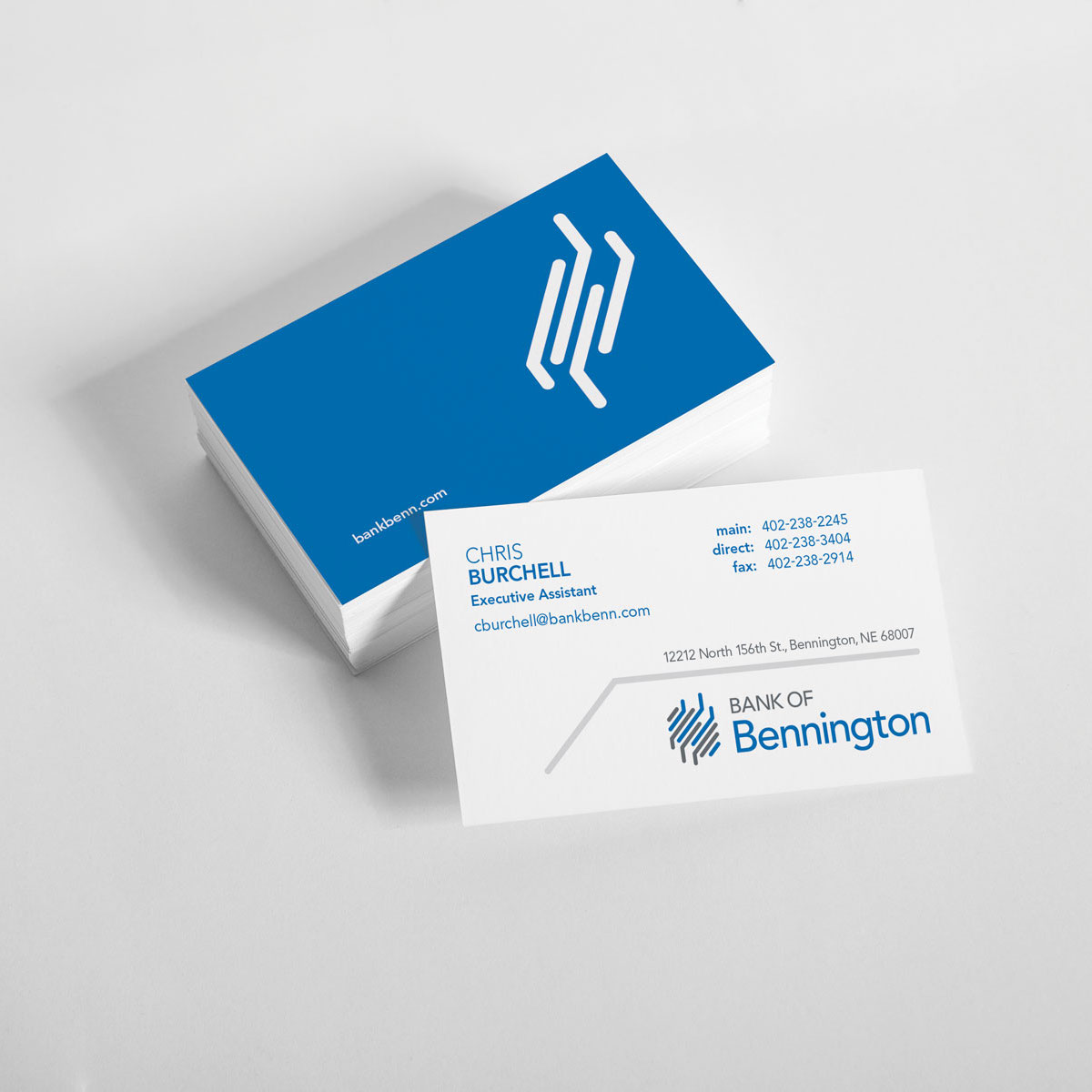
The stationery package further reflects the collaborative, dynamic relationships Bank of Bennington nurtures with its commercial and retail customers.
Following the brand identity phase of the project, we extended our partnership with Bank of Bennington into environmental design.
To further implement the new look and feel of their brand, Bank of Bennington made the decision to renovate their primary Bennington, Nebraska location. We conceptualized and designed new teller stations and an interior lobby feature wall to bring the brand to life in the remodeled space.


