20 west kinzie rebrand
20 West Kinzie is a stunning 17-story, 385K SF, Class A building in Chicago’s top professional services and entertainment district: River North.
challenge
Formerly Dearborn Plaza, the building and brand had become well-weathered after 15 years in operation. Home to Google and a number of other leading-edge companies, the space was still “prime time.” Developers called on David Day Associates for a brand identity and website design to match.
solution
brand identity
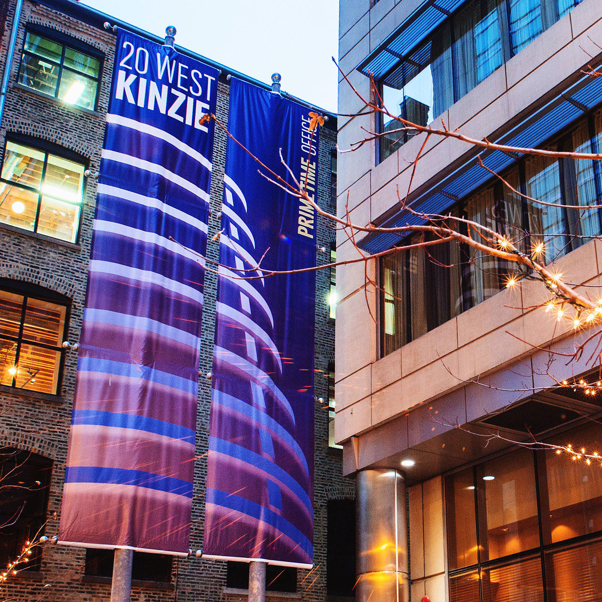
Emphasizing the jaw dropping silhouette of the building itself, the brand identity has structure, movement and intrigue. All at once it suggests innovation, stability and a mood fit for the spotlight. The color palette is fittingly warm and bold, accented by bright photographs of the cityscape by day and night.
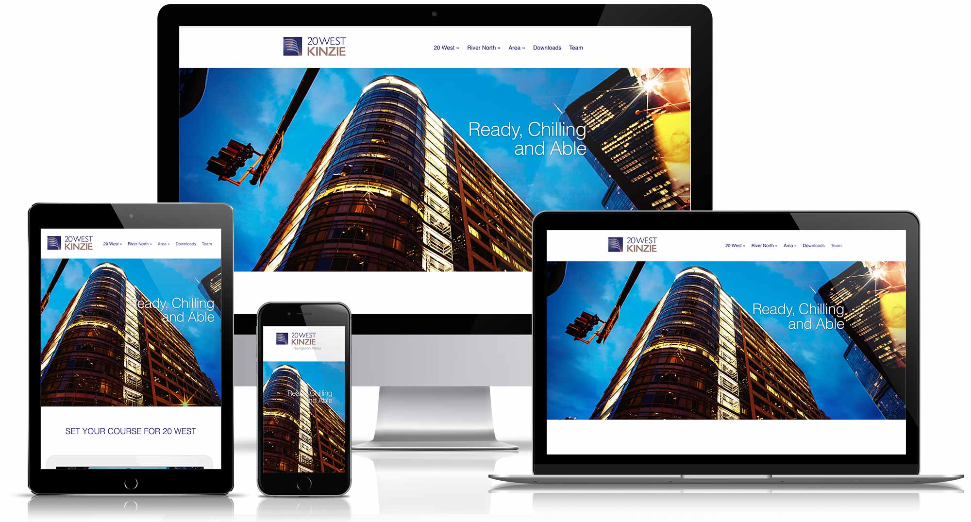
The large-wingspan responsive website is direct and informative, and is perfect for the entrepreneurial minds it’s meant to intrigue. Through social media channels it allows users to search floor plans and elevations, as well as local restaurants, galleries and must-see attractions in the neighborhood.
impact
Just 60 days after launch two leading-edge Internet startups signed deals in the building with promising options for expansion.


